

Gala Brand Guidelines
In this Section:
MAKE-A-WISH® EVENTS
Our events are another opportunity to invite others into the mission of our organization.
It’s important that pieces associated with these events maintain the professionalism, consistency and emotion of our brand. As with other collateral, we recommend that gala materials feature the Make-A-Wish brand elements prominently, and that information is presented in a way that reinforces our core messaging pillars: impact, need, fit and emotion.
Back to the top of the page ↑
EVENT THEMES
With our new brand, we have even more possibilities to use our fundraising events to explore who we are and what our mission is all about. While it may be tempting to fall back on tried-and-true themes such as "Summer in Tuscany" or "Dancing with the Stars," we encourage every event to maximize the presence and impact of our brand equity. Our goal for each event is to engage with the Make-A-Wish brand and mission, in whatever way makes the most sense for your event.
Note: Always make sure your event name, theme or idea does not infringe on copyrights, e.g. "Under the Tuscan Sun."
Back to the top of the page ↑
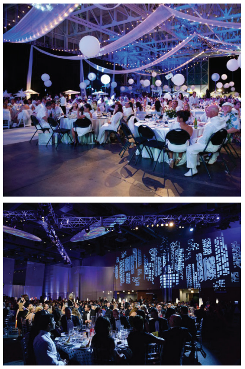
EVENT DECOR
Event spaces are a great opportunity to explore our Make-A-Wish brand and mission. We have a chance to build out decor that reflects our visual brand essence and, thus, event collateral should always prominently feature our Make-A-Wish blue as much as possible.
Not all venues are aesthetically equipped to work with our Make-A-Wish blue. Therefore we strongly recommend that, when considering venues, preserving our brand equity is a top-of-mind consideration. Does the space have the potential to amplify our blue, or will it clash? If choosing a complimentary venue isn’t possible, we encourage the use of our secondary colors, but our blue should still be present.
Back to the top of the page ↑
SPONSORSHIP HIERARCHY
Title sponsors can be an important contributer to the success of a gala event, and we want to be sure to prominently honor their partnership while also ensuring that the Make-A-Wish brand remains at the forefront of an event.
To accommodate title sponsors, please use the following formula: [Event] brought to you by XX. (For example, The President’s Reception brought to you by XX.)
Back to the top of the page ↑
TYPOGRAPHY
When it comes to properly representing a brand, the consistent usage of approved typefaces is an important facet of reinforcing our visual identity. While the general Make-A-Wish brand has defined typography guidelines, events often call for expanded type treatment options that further elevate its elegance. While it may be tempting to step outside these type treatments for particular occasions, please utilize the typefaces on the following pages for any Make-A-Wish event.
Back to the top of the page ↑
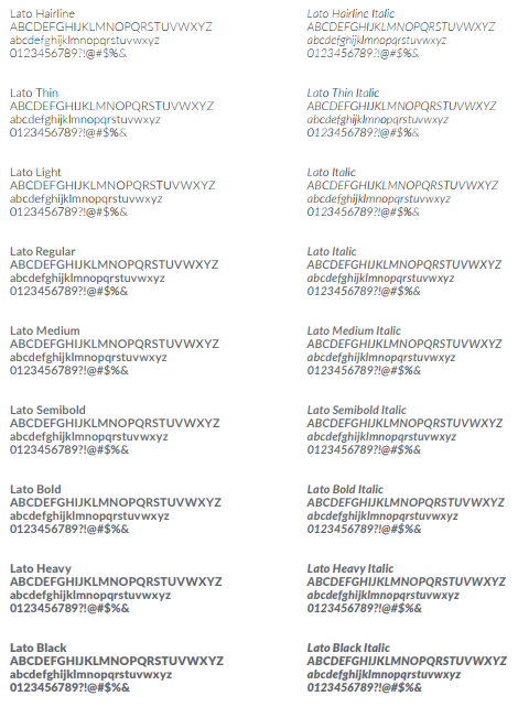
PRIMARY SAN SERIF TYPEFACE
Lato is a contemporary and legible font choice with a variety of weights for design flexibility. It also supports many international character sets. If a language is not supported, contact Make-A-Wish International for assistance.
It is available for free to download, as well as for use with both Google Fonts and Adobe Typekit. Its usage ranges from headlines to body copy. It should also be used primarily when numbers occur. When Lato is unavailable, it should be substituted with Arial.
Arial should only be used when Lato is unavailable for use.
Back to the top of the page ↑
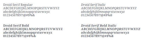
PRIMARY SERIF TYPEFACE
Droid Serif is a beautiful, slightly condensed typeface with an attractive italic. It is best used for larger headlines to create a story-driven look, and was originally designed for the highest level of onscreen legibility. It also supports many international character sets. If a language is not supported, contact Make-A-Wish International for assistance.
It is available for free to download, as well as for use with both Google Fonts and Adobe Typekit. If Droid Serif is unavailable, it should be substituted with Georgia.
Georgia should only be used when Droid Serif is unavailable for use.
Back to the top of the page ↑
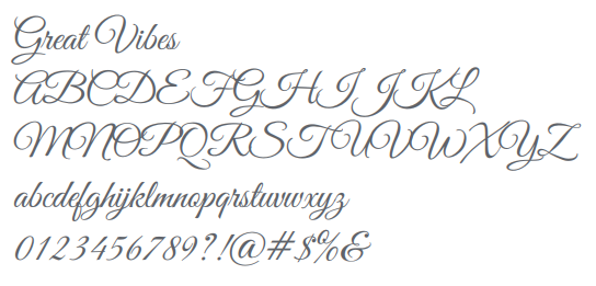
SCRIPT TYPEFACE
In addition to the two primary brand typefaces, a third, script typeface may be used for Make-A-Wish gala materials. Great Vibes is a beautiful script that is neither too masculine or feminine, juvenile or stuffy. Its elegant characters evoke high-end sophistication.
It is recommended to use Great Vibes in sentence case form, never in all caps, however, capital letterforms may be used to create monograms and drop caps. This script typeface is best for larger, more prominent headlines, and should never be used for body copy. It is available for free to download, as well as for use from Google Fonts.
This script typeface is only to be used in conjunction with events. It is not an approved typeface for other brand applications.
Back to the top of the page ↑
PRINT TECHNIQUES
Interested in making a classy statement? Want to be as cost-effective as possible? Have a crunched timeline? These questions are important to ask when assessing a print project. The next few pages outline different print processes to provide guidance on cost, timing and design considerations.
Back to the top of the page ↑
ENGRAVING
Engraving is ideal for an ultra-formal affair (and has the price to match—it’s one of the most expensive printing methods).
With engraving, the letters are raised on the front and indented on the back of the invite. It’s also a great option if you are printing on colored paper. The ink used is incredibly thick, so you can print a light ink on darker paper and it will still show up. While you can incorporate multiple ink colors with engraving, it’s more time-consuming (and expensive), as each color requires its own plate and a separate pass on the printing press.
An engraved invitation order can take anywhere from two to six weeks to complete depending on the printer and the proofing process.
Back to the top of the page ↑
THERMOGRAPHY
Thermography is similar to engraving, except that the lettering is slightly shiny and the back of the invitation remains smooth.
While thermography has a formal look, it comes without the hefty price tag of engraving. Cotton fiber is usually a good paper option with this method. Avoid pearlescent or shimmery paper with thermography, since the combination of two shiny elements won’t look good together and will be difficult to read.
Because this method fuses ink with powder, it’s not as easy to reproduce pastel hues. We advise sticking with lightly colored paper and darker ink. Additionally, thermography is best for small graphics, but doesn’t work well for full-color images.
A thermography order can be completed in just a few days, depending on the vendor.
Back to the top of the page ↑
LETTERPRESS
Letterpress offers a textural and sophisticated look with art that is slightly indented on the front and raised on the back.
This method is normally used for traditional designs, and is one of the priciest printing methods. However, many stationers offer off-the-shelf designs that are lower priced, but have fewer options for customization.
Letterpress requires soft, bulky paper, so you’re limited to thick card stock, like cotton fi ber or bamboo paper. White or lightcolored paper and darker inks work best with this technique because the ink used on letterpress is thin. White or pastel inks tend to look grey and dull on darker paper. Because each color has to be pressed separately on the paper, it’s more affordable—and quicker—to use one or two ink colors.
Depending on your vendor, an order can take anywhere from two weeks to two months.
Back to the top of the page ↑
DIGITAL PRINTING
Digital printing allows for a great look on a small budget and short timeline.
The results of this technique are superior to what can be achieved from an offi ce laser printer, and avoid the fading or smudging that occurs when printing materials on your own.
Most digital printing is typically done on thinner paper, although a few companies can print on thicker cotton fiber paper. While the ink won’t appear as dynamic using other printing processes, you can generally choose any color(s) you’d like.
For smaller print runs, this is oft en the least expensive and fastest printing option, requiring just a few days forproduction and shipping.
Back to the top of the page ↑
OFFSET PRINTING
The most traditional and time-honored printing method, offset printing provides a high-quality presentation.
Offset printing is similar to digital, but the quality is significantly higher and is slightly more expensive. The letters and designs are flat. It’s a great budget-friendly printing method that works well with a wide variety of designs.
More paper options are available with offset printing than digital printing, so it works well with unique textured papers like cotton or bamboo. Designs and lettering will look more vibrant than with digital printing, offering a wider spectrum of color and design choices.
Off set has a slightly longer turnaround time than digital – usually a few days to a week. Unlike digital printing, a custom plate is required and the ink is premixed beforehand. This adds a few extra days to the process.

Back to the top of the page ↑
FOIL STAMPING
Foil stamping traditionally complements a luxe event, but is also becoming popular for more casual invites.
Try creating a dramatic effect using lighter foils (like silver and white) on darker papers. Keep in mind, however, that thin, delicate lines won’t reproduce well, so design options may be more limited. Too much foiled text is difficult to read, so it’s best to restrict it to keywords, borders or intricate designs. A little goes a long way!
Foil stamping is the most expensive printing process and is often outsourced, which means a longer turnaround time. The process typically takes around 10 business days with a vendor who completes the stamping in-house, but up to two months if you are using one who doesn’t specialize in foiling.
Back to the top of the page ↑
EMBOSSING
Embossing is like engraving, but on a slightly larger scale—letters and images appear raised, but colorless. With a subtle but modern look, it is perfect for monograms and bordering.
Embossing is typically done on thicker paper stock like cotton fiber so that the designs show up with crisp lines and impressions. Inkless embossing (also known as blind embossing) is a popular choice for a delicate touch. Adding colored ink is also an option, but it could limit the flexibility of your design.
Because embossing is very similar to letterpress and engraving, it typically takes about the same amount of time to print, which generally takes about three to five weeks.
Back to the top of the page ↑
PRINT ADD-ONS
Used properly, these additional production items can add a lot of impact to the final printed design.
| Wax seal | Perforations |
|---|---|
| A very traditional form of sealing envelopes. | Small holes in the paper create a design or effect. |
| Belly band | Edge painting |
|---|---|
| A piece of material that wraps around an invitation suite to hold it all together. It can be as simple as a ribbon or as luxe as laser-cut paper or a piece of lace. | Painting or inking the edge of thicker card stock; it’s often done on an invite with a beveled edge. |
Back to the top of the page ↑
SAMPLE COLLATERAL
In the following pages, you will find design examples for different Make-A-Wish events across the organization, as well as some ideas for invitations. Take note that these are simply examples of what is possible, and that there is always room (within the prescribed guidelines) for creativity!
Back to the top of the page ↑
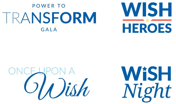
EVENT LOCKUPS
To help maintain a legible and cohesive visual system, here are some sample approaches to branding an event that use Make-A-Wish typefaces and color while also creating a unique vision for the event.
It may not be visually ideal to lock up the Make-A-Wish logo with your event logo. However, it is important that the Make-A-Wish logo is prominently displayed near the event logo in event collateral.
When using in conjunction with the Make-A-Wish logo, clear space rules still apply.
Back to the top of the page ↑
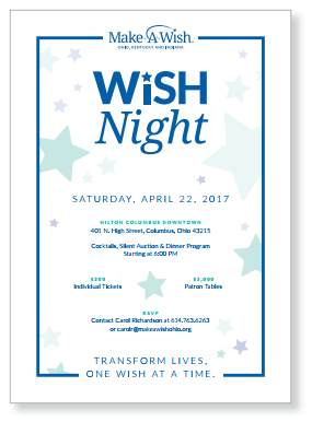
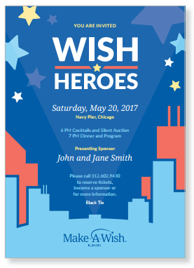
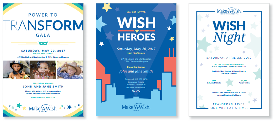
SAMPLE INVITATIONS
Event invitations and other collateral should match the style of the event. In other words, a casual event wouldn’t have formal collateral. The samples shown here represent several different approaches to invitations, ranging from casual and fun to more formal and reserved. Paper can also change how a printed piece comes across. Colored paper stock, overall weight and different textures can create a memorable and unique invitation.
Production can play a major role in this area. Please see pages 9–17 for more information on production techniques.
Back to the top of the page ↑
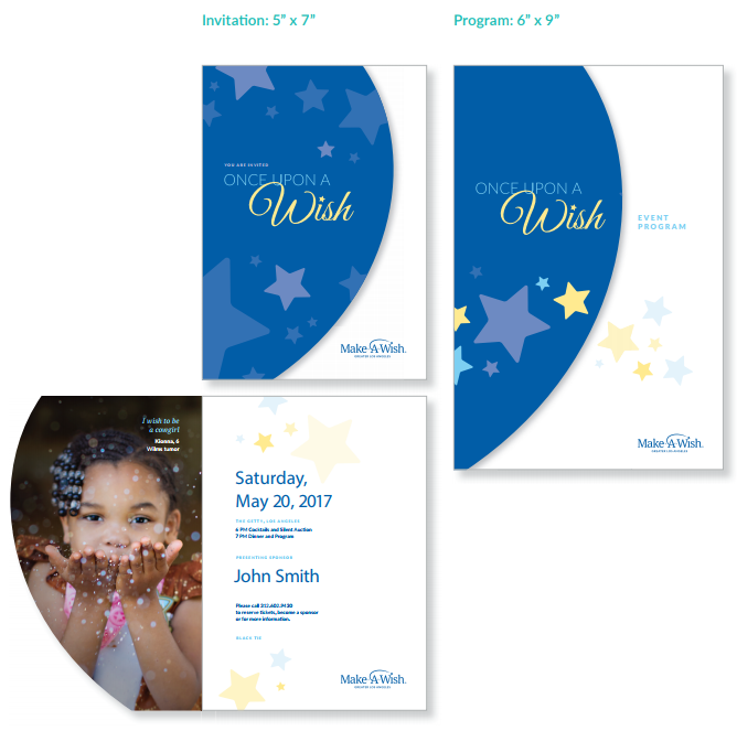
PRINT PIECE DIMENSIONS
It is recommended to keep all pieces of event collateral consistent – even if they are not the same size, the proportions should be similar. For example, if an event invitation is a rectangle, the reply card, envelopes and event program should also be rectangular.
In the sample shown to the right, not only do the invitation and program share an overall sense of proportions, but also a curved, short cut front cover and star motif.
Back to the top of the page ↑
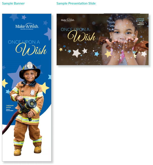
ADDITIONAL EVENT ASSETS
From banners and table signs, to plaques and presentations – an event may require the creation of many additional materials. To ensure a sense of visual unity, these items should be designed with repeated visual elements (iconography, type treatments and color palette).
Back to the top of the page ↑