

Design Elements
When it comes to our brand beyond the logo, consider the following pages a source for additional assets that can be utilized to succinctly tell the story of Make-A-Wish. Visuals typically help amplify the impact of written words, so don’t hesitate to use the following elements to supplement what you are trying to communicate.
In this Section:
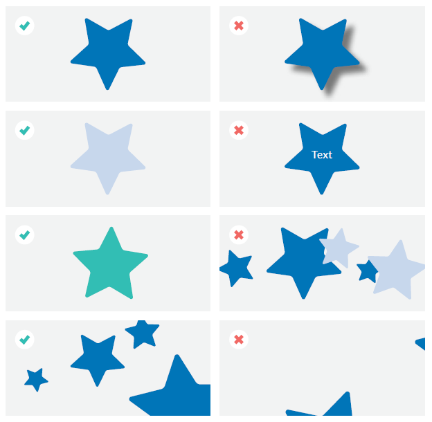
THE STAR
Our Make-A-Wish star is a motif that can be used across all mediums (however, a reminder that this symbol is not to be used in place of the Make-A-Wish logo). Only the Make-A-Wish star can be used – it may not be substituted with a different star shape. It can be in any of the brand colors (blue or secondary accents) including tints. Feel free to rotate or resize it as needed; it can also be used in a group of other Make-A-Wish stars, however, the stars should not overlap. If ever cropped, a majority of the star should still be visible. Note that the star should not have drop shadows applied to it.
Back to the top of the page ↑
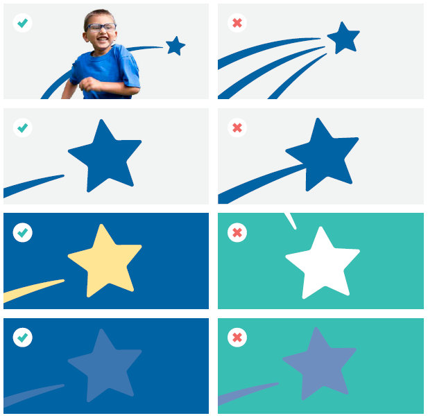
THE SWIRL
The Make-A-Wish swirl may be used if, and only if, it appears with the star. This lockup will be provided by Make-A-Wish, however, it may be resized, rotated and may interact with subjects in photos. The lockup should follow all standard misuse guidelines as the main logo (page 51), and may appear in any of the colors in the brand palette including all secondary colors. Tints may also be used (pages 56 and 57).
When rotating, avoid the appearance of a "falling star" by having the swirl at the top. If cropped, there should always be roughly 75% of the star present to keep the integrity of the lockup. Additionally, the lockup may not be altered – this includes spacing of the two elements, proportions or number of elements.
Back to the top of the page ↑
ICONS
Icons are symbols that represent some real, imaginary or abstract motive, entity or action. Our use of icons is to help visually illustrate what we are trying to communicate to our audience. This catalogue of icons is the definitive visual representation of key components of our brand. Don’t try to recreate your own. If there's an icon that doesn't exist, please submit a request to the National Office.
They are designed to be clean and simple, and can be used in either full-color positive (in either blue or one of the secondary accent colors) or reversed out white on a colored background.
![]()
Back to the top of the page ↑
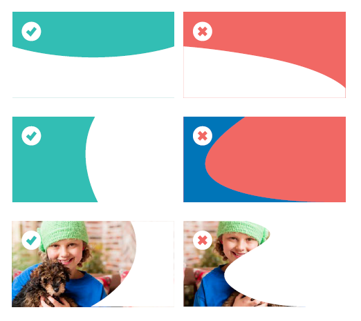
CURVED ELEMENTS
To add visual interest to a document, video or ad, it is possible to add our signature “curve” to block in colors or photos. This element can appear on any edge of a piece, and is a great way to help adhere to clear space rules (page 46).
Curves should always be either equal (same amount of curve on opposite side of center point), or following an upward path. They should never have a downward slope. Every curve should also only have one center point – multiple points may create an undesired wave effect. This center point should also be away from the edge as to not create a harsh edge.
Curves may incorporate both the blue and/or any of the secondary accent colors. If using as an image container, the curve must not crop out any important features of the photo (e.g., a person's face or dominant action).
Back to the top of the page ↑
DESIGN ELEMENTS TO AVOID
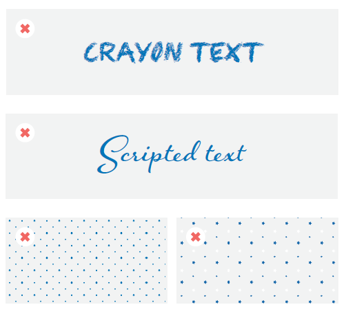
While our organization serves children, the Make-A-Wish brand should always maintain an appropriate level of professionalism and consistency. Design elements such as crayon or scripted text should be avoided. Only brand-approved fonts should be used (pages 59 and 60).
The use of patterns in Make-A-Wish materials is discouraged. Make-A-Wish does not have official brand patterns that can be employed.
Back to the top of the page ↑