


Color Palette
The Make-A-Wish brand colors evoke positivity and child-like wonder. The bold blue is the heart of our color story, while secondary accents in a range of hues provide flexibility and warmth. When choosing a color, stay within the palette outlined in the following pages.
In this Section:
PRIMARY COLOR PALETTE
Make-A-Wish blue is the core color of our brand.
It should be present and most prominent in each and every communication, without exception.

Back to the top of the page ↑
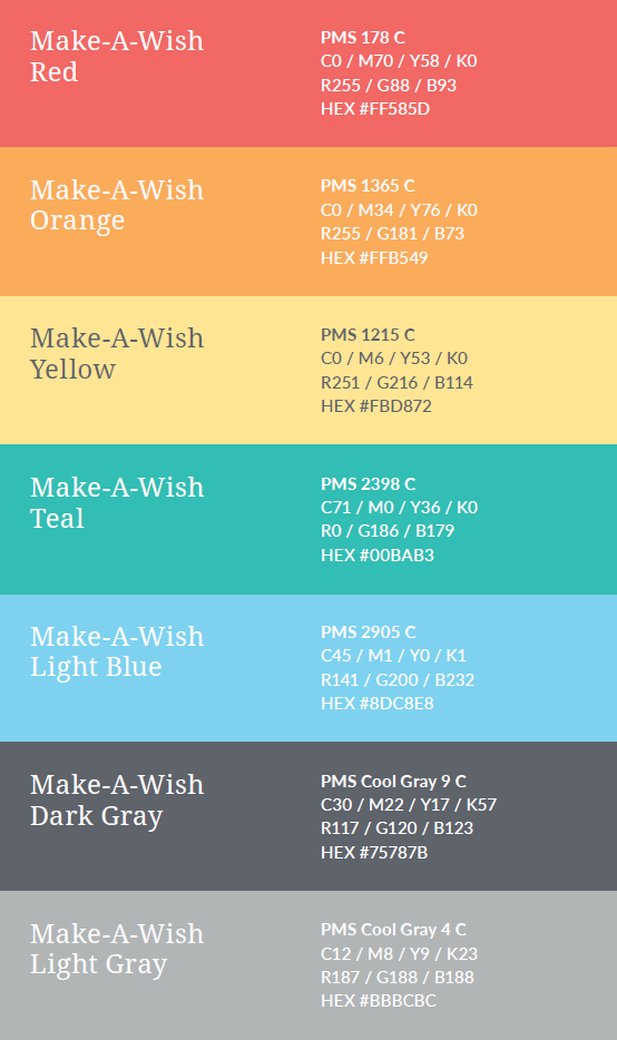
SECONDARY COLOR PALETTE
Bright colors should play a supporting role. Use them only as secondary accents to complement the primary blue. In most cases, only 1–2 secondary hues should be used in addition to the blue to avoid a cluttered appearance.
Full shades of color should be used as the default; however, tints of secondary colors can be a good strategy for certain graphic elements like graphs, diagrams, charts and tables. Tints of secondary colors should not be used for text, where it is likely too hard to read.
No gradients should be used.
Back to the top of the page ↑
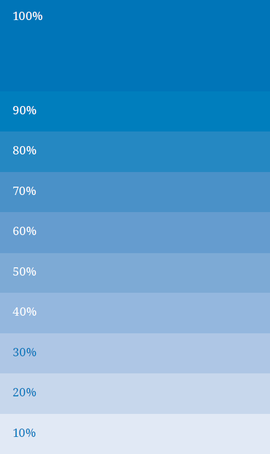
PRIMARY PALETTE TINT USAGE
When using Make-A-Wish blue, the following tints can be used. Please keep in mind text legibility and contrast against lighter tints – reversed text should not be used on tints less that 40%.
Back to the top of the page ↑
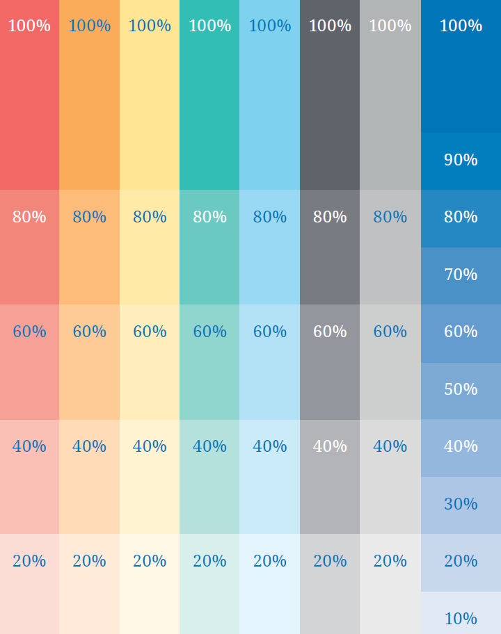
SECONDARY PALETTE TINT USAGE
Like with Make-A-Wish blue, the secondary accent colors may use tints, although just not as many to maintain clarity and consistency. As with lighter tints of the primary blue, secondary hues may not allow for reversed out text to maintain overall legibility.
Back to the top of the page ↑