Primary Logo
For use on all communications. Do not alter the logotype in any way. Do not replicate the logotype as a solid pattern. Do not use the logotype as a watermark. Always include the registered trademark symbol (®) as shown.


“A helpful way to think about brand is to say that your brand is what people say about your product or service when you’re not in the room.”
–Sheralyn Pratt, Build Your Brand
Before incorporating the Make-A-Wish logo and iconography in your design, please consider our branding guidelines.
If rescaling the artwork is necessary, make sure the registered trademark symbol (®) is set at a size that is unobtrusive, yet legible within your layout.
For use on all communications. Do not alter the logotype in any way. Do not replicate the logotype as a solid pattern. Do not use the logotype as a watermark. Always include the registered trademark symbol (®) as shown.

For use only on communications where the layout space is limited. Not to be used on any standard business collateral or standard promotional material.
Downloadable MAW logos (with clear space guidelines and examples)- sponsor-specific permissions needed in EDAM
Swirl and Star Usage
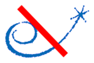
The use of the swirl and star in any manner as a stand-alone element or as part of another logo is prohibited. It may only be used as part of the primary or secondary Make-A-Wish logo.
Clear Space
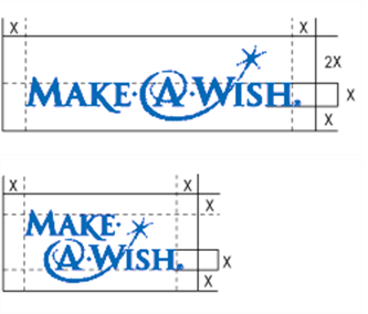
Keep the area around the Make-A-Wish logotype clear of all type, photos, illustrations, or other graphic elements. These elements should not be placed closer to the logotype than the clear space area shown here. Whenever possible, use more than the recommended clear space. The logotype should always appear on a clear and uncluttered layout. It may not be placed on a patterned or complex background.
Minimum Size
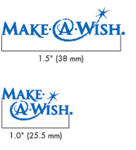
The logotype may not appear smaller than the minimum size shown here, except on certain merchandising items such as pens where the print area is very small. Always check the logotype while it is being printed for quality and legibility.
Logotype and Layout
The Make-A-Wish logotype should always appear on a clear and uncluttered layout. It may not be placed on a patterned or complex background but it can be placed against a photographic background. Make sure the area behind the logotype is not too busy and provides sufficient contrast.
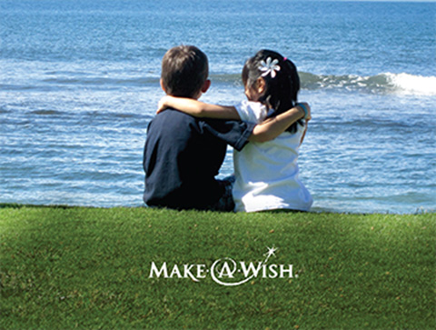
Use logos for sub-branded programs, events and campaigns sparingly and strategically. Too many sub-brand names drown out the Make-A-Wish master mark. Sub-branded programs, events or campaigns must use logos provided by Make-A-Wish America where they exist.


Make-A-Wish type fonts are Futura and Century Schoolbook.
Futura is a modern, sans serif typeface that is ideal for producing clear, highly legible headlines and text.
Century Schoolbook is a classic serif typeface that complements, yet does not compete with, the Make-A-Wish logotype.
Futura is not a font that is installed on many office computers. In this case, it is acceptable to substitute Futura with Century Gothic for sans serif font applications.